On December 1, 2014, Cypress Semiconductor announced that it was acquiring fellow chipmaker Spansion for $1.6 billion. When then-CEO Thurman Rodgers presented the deal, the stock market responded approvingly. An analysis showed that once other confounding influences had been ruled out, the share price of Cypress had jumped up 13% after the deal’s announcement. Clearly, investors believed in the company’s rationale for the purchase.
An examination of the longer-term consequences of the deal suggests that their optimism was warranted. When we looked at the value of the company a full year later, we found that its market cap was still 13% higher than it had been before the acquisition. The stock market had accurately anticipated the deal’s potential.
Two years earlier, by contrast, on December 12, the pharmaceutical firm the Medicines Company had announced that it was going to buy the specialty drugmaker Incline Therapeutics. It turned out to be very similar to the Spansion deal in terms of value creation: A year later the combined entity’s market cap was also 13% higher. But when Clive Meanwell, the CEO of Medicines, had presented the deal to the financial markets, the response was lukewarm: The share price rose by only 1.8%. Clearly, investors hadn’t understood the reasons for the purchase.
This turns out to be a pattern. When we analyzed a sample of 654 large deals in the United States that had taken place from 2012 to 2017, we frequently found this kind of disparity between comparable deals. With any given acquisition or merger, the markets might or might not immediately factor in the value that the company predicted it would add.
What determines whether investors believe in CEOs’ presentations? To find out we conducted a statistical analysis using event study methodology, in which researchers determine what characteristics of an acquisition (“the event”) explain how the stock market responds to it. And among the acquisitions in our sample one seemingly simple but significant factor emerged: When presentations were accompanied by a slide illustrating the strategic rationale for a deal, investors were more than twice as likely to give it an immediate thumbs-up. The positive impact of strategy visualizations, as we will call them, on postannouncement valuations was four times larger than the impact of other visual tools such as photographs, maps, logos, and even bar charts and line graphs.
In this article we’ll explain why visualizations are so important to the communication of strategy and describe, using a detailed example, how to create one that will win buy-in from employees and investors alike. We’ll conclude by showing that despite the powerful effect that a strategy visualization can have, only a quarter of corporate presentations on deals include one, and when they do, it often isn’t designed to have impact. All told, fewer than 20% of visualizations do an effective job of describing companies’ strategic decisions.
Why: Seeing Is Believing
Most executives agree that business strategy is a set of choices regarding how and where a firm wants to create value and compete. But what many forget is that strategy also requires an interpretation of what the choices imply, which needs to be explained simply and clearly.
Through a process that the University of Michigan organizational psychologist Karl Weick calls “sensemaking,” executives develop an understanding of their business context and how their firm will operate in it. This generally involves categorizing types of competitors and potential customers and identifying the firm’s key resources and capabilities and the main cause-and-effect relationships among them. This understanding is organized into what we call “a cognitive map.”
A good strategy reflects such a map. In fact, executives usually create a draft of one as they develop their strategy. While discussing and debating what direction the company should go in with colleagues, consultants, board members, and others, they often draw circles, boxes, and arrows that represent important elements of the proposed strategy and the relationships among them on flip charts and slides.
Once executives reach agreement on a strategy, they need to communicate it to other stakeholders, who must understand it and act on it. The daily decisions of employees, for example, need to be guided by the same understanding of the firm’s strategy. If they don’t make different choices as a result of a new strategy, then you don’t have a new strategy.
This is when executives must switch from sensemaking to sense giving: They need to transfer their cognitive map of the firm’s strategy to the minds of employees and investors. Our research suggests that reinforcing a verbal presentation with a visualization of the strategy and how it works is the most effective way to do that.
What: The Case of Capitec
The story of Capitec—which is now the largest retail bank in South Africa and was named the best bank in the world by the Lafferty Group for two years in a row—provides ideal material for an effective strategy visualization. Let’s look in more detail at the company’s strategy.
Capitec was founded in the early 2000s. Analyzing the landscape for consumer banking in South Africa, which had long been dominated by the same four big banks, its founders realized that to gain a foothold in the market, they had to focus—at least initially—on a customer segment that had been neglected by the incumbents. Those customers were low-income people who often did not have a bank account. The founders described them as “lacking financial literacy.” This was their first strategic concept.
Next the founders thought through the value proposition that those customers would require. The strategic concept they came up with here was “a single, simple account” that would serve the customers’ basic needs and nothing more. To deliver that proposition they decided to focus explicitly on four mutually reinforcing subconcepts: affordability, simplicity, accessibility, and personal service.
These were not hollow, abstract terms but would be translated into concrete customer benefits and ways of operating. Affordability meant charging fees low enough to tempt people to switch from cash to banking: Capitec’s fees were half its competitors’. To be able to offer them and still make a profit, Capitec had to keep its costs down. (The bank broke even the year after launching.) To do that, it needed to have scale, and to achieve scale it kept its offering and operations very simple (the second subconcept). For example, it offered just one type of account, which could be used only for saving, borrowing, and making cashless transactions. The founders believed that the simple offering sufficed for low-income customers, who would benefit little from ancillaries like insurance, credit cards, and currency exchange.
The third subconcept, accessibility, addressed the need to lower the barriers preventing the target customers from using the bank’s services. To that end, Capitec would rely on face-to-face service in a large network of physical branches. Each would have an entirely open storefront, some very simple self-service machines, and a color-coded scheme (including red and blue carpets) that indicated to people (who might not be able to read) where to go. Crucially, Capitec would employ people from the local community so that customers would be served by someone who spoke their language and behaved according to their customs.
That brings us to the fourth subconcept, personal service. Capitec hired people from the retail and hospitality industries rather than from banking because it wanted to emphasize service. It could do this because its technology platform was so simple to use. What’s more, the founders reckoned that these employees’ local market knowledge and networks would deliver more sign-ups and very low loan-default rates. The staff would know who the good prospects were and who was likely to pay back unsecured loans—and who wasn’t. The combination of high sign-ups and low defaults would make for a happy combination of low branch costs and high lending margins.
Collectively, the value proposition and its four subconcepts determined a third main strategic concept: the resources and capabilities the bank would need to invest in. For instance, as we’ve noted, the value proposition presupposed a large network of branches with a particular layout. It also would require a technology platform (Capitec stands for “capital” and “technology”) that would make activities like opening an account extremely simple for the staff and customers alike.
In addition, the value proposition defined the internal culture the bank needed to foster. Traditionally, financial institutions in South Africa favored a formal, almost stiff, and often hierarchical culture—perhaps because they wanted to convey a sense of seriousness to employees and customers. This was reflected in their interactions with customers and the design of their branches. Capitec wanted its employees to present an informal, welcoming face to low-income customers, who might feel uncomfortable, even scared, going into a bank.
A verbal description of this strategy, while compelling in the moment, may be hard for people who did not develop it to internalize. But it is possible to capture almost perfectly in a single slide the relationships and causalities among all the concepts making up the strategy, as you can see in a slide that we developed, which is shown in the exhibit “The Right Way to Design a Strategy Visualization.” In it you can easily see the three main strategic concepts. In the center is the value proposition (“a simple, single account,” with its four subconcepts and their tangible manifestations). The key customer segment (people “lacking financial literacy”) is on the right, and the necessary resources and capabilities (“a local branch network” and what it would offer) for meeting the segment’s needs are on the left. The visualization also shows how each of the three concepts feeds into the others to create a profitable dynamic.
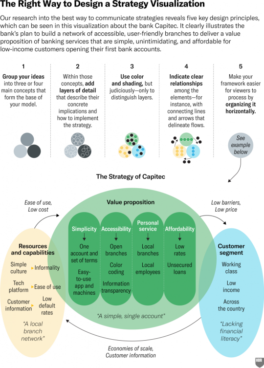
Any manager who sees this visualization as part of a presentation would almost certainly internalize it. Employees could pin it on their office walls, and it could serve as a foundational slide for any presentation of a strategic recommendation they’d like to make. Investors who see it would get a very clear idea of how the company creates value.
So how can you make sure that a visualization of your strategy will be as effective?
How: What Makes a Great Strategy Slide
Humans are visual creatures. More than 50% of our brain is involved in processing what we see, which may explain why research shows that we absorb visual information more quickly and accurately than other types of information—provided that it’s organized properly.
To understand how best to communicate visually in the context of strategy making, we recruited 57 executives (from our London Business School executive MBA program) to study a total of 60 strategy visualizations, which we obtained from various companies. We asked the executives to assess about 15 each, and as they did so we used eye-tracking technology to see where they directed their attention. Then we asked them how much they had gotten out of each visualization they’d looked at (whether they had “learned something,” “gained insight,” or had acquired “enhanced understanding”) about the firm’s strategy. Of course, this is somewhat subjective. Even if participants thought they had learned a lot, we don’t know for certain whether they really had or if they just felt they had. But we’re confident that at least the converse holds: If multiple executives said they hadn’t learned anything about a company’s strategy by studying its visualization, it was probably not a very effective one.
We also measured several properties of each of the visualizations and then statistically analyzed them, using a regression model, to see which of their characteristics enabled the executives to understand the firm’s strategy better. We combined those insights with the data from the study on how stock prices moved when acquisitions were announced with and without an accompanying strategy visualization. The results pointed to five concrete design rules:
1. Group your ideas into three or four main concepts that can serve as a base of the strategic model.
In our sample we saw many frameworks that contained a lot of components—sometimes dozens of them. That’s understandable, as business environments and strategies often are complex. However, a good visualization—and therefore a good framework—consists primarily of a few main components that allow people to logically fill in the details, like the operational choices that must be made to support them. Our analysis showed that simple visualizations with fewer components got a much more positive reaction from the stock market than the complex ones with many.
That finding aligns with a study by Michigan State University professor Gerry McNamara and colleagues, who examined executives’ mental models about types of competitors in their industries and found that the companies of executives whose models had fewer elements had significantly better financial performance. It also aligns with studies by Jennifer Summerfield using fMRI imaging, which show that people need only three concepts to create rich, coherent stories.
In our study with the 57 executives, we also examined the degree to which the strategic components were independent. We found that when the main components were not in some way connected to one another in a visualization, the executives began to have trouble understanding the firm’s strategy.
This phenomenon is a result of the way the human brain has evolved to process views of landscapes. Although a landscape may have distinct elements—mountains, forest, a river, and grassland—those components are also intertwined, forming one coherent picture. A good strategy visualization mimics that: It displays a limited number of clearly identifiable components that are, nonetheless, also clearly linked to one another.
2. Create layers with increasing detail.
When we look at a landscape, we see its components, but we can then zoom in on each one of them to discern more detail. For instance, we might examine a mountain range to see where the terrain is least steep and rocky to figure out where we can best pass through. Similarly, a visualization works best if each of its main components contains more detail that we can zoom in on to learn more.
Consider our Capitec visualization again. If you look at the firm’s value proposition in it, you clearly see the four subconcepts defining it. For each subconcept you can then go down into a further layer. For instance, you can see what constitutes the subconcept accessibility: the physical openness of its branches, the color coding of different service areas within them, and transparency, which comes from practices like making employees and customers look at the computer screen together when filling out a loan application.
The layers move the framework beyond abstraction: They show the concrete implications of the bank’s conceptual choices and thus tie the strategy to implementation.
3. Use color and shading only to distinguish the layers.
In nature we discern individual features, depth, and layers through color differences. Forests and mountains, for instance, have different colors, and relief and depth have different shading. We found that colors play the same role in visualizations. When we analyzed the effect that multiple colors and different shading in a visualization had on people’s comprehension of a strategy, we found that the more they were used, the harder it became for people to understand the strategy. The exception: When colors and shading were used to distinguish layers in the model, comprehension improved. This is another reason our visualization of Capitec’s strategy is easy to understand.
4. Indicate a clear sequence of relationships among the elements of the framework.
In our study of strategy presentations around the time of acquisitions, we examined whether visualizations of frameworks contained connectors that provided information on the relationships among the components. Such graphics are known as flow diagrams. We found that adding elements indicating flows to a visualization increased the stock market valuation of a strategy by 64%.
The fMRI studies conducted by Summerfield reveal that stories have a flow too. They’re about one thing leading to another, and they’re processed in the part of the brain that conceptualizes cause-and-effect relationships. So the flows in a good visualization parallel and reinforce the story the company wants to tell. The ones shown in our Capitec slide, for example, mirror the story about how the bank built a network of accessible branches with people from the local community so that it could deliver a value proposition of banking services that were simple, unintimidating, and affordable for low-income clients opening their first-ever bank accounts.
5. Organize your framework horizontally.
Finally, we discovered that the executives found it significantly easier to gain insight into a firm’s strategy if its framework was presented in a predominantly horizontal fashion. This effect was strong, and it probably reflects the context humans evolved in again: Landscapes are horizontal. So it’s not surprising that our horizontal peripheral vision is 180 degrees, whereas our vertical peripheral vision is only about 135 degrees.
Indeed, research on visual cortex sensitivity pioneered by David Hubel and Torsten N. Wiesel, who received the 1981 Nobel Prize in Physiology or Medicine (shared with Roger Sperry) for this work, revealed that the neurons in our visual cortex are more attuned to horizontal orientations than to other orientations. Horizontal layouts, therefore, are easier for the brain to process.
Most of the 170 presentations (out of our sample of 654) that included strategy visualizations did conform to some of our recommendations. About 65% of them were organized in a predominantly horizontal fashion. (They were probably prompted to do so by the default landscape orientation of PowerPoint.) About 90% also displayed framework components that were visually distinct. (In the remaining 10% the individual components weren’t clearly separated but were lumped together in, say, a matrix or a graph.) And 71% illustrated the connections among the parts of their models with arrows, overlaps, or similarity in colors.
However, we found that fewer than half the visualizations presented a horizontally oriented framework with clearly distinguished components and explicit interrelationships among them. But the most dramatic shortcoming was the absence of layering: Only 32% of firms provided extra layers of detail in their model. All told fewer than 20% of the visualizations—that is, just 32 of the 170 we looked at—made it easy for employees and investors to develop a clear understanding of the company’s strategy.
Yes, Design Rules Do Matter
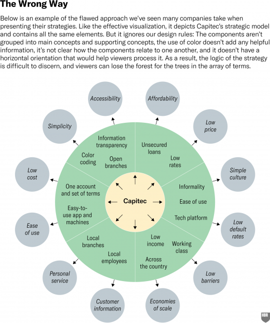
We then decided to test just how much of an effect following our guidelines would have on people’s understanding of a strategy. We recruited 150 people with at least three years of management experience and divided them into two equal groups. We provided a very short description of Capitec (anonymized as “T-Banc”) and then showed them either the good visualization we had created or a flawed version. While this second version contained the exact same concepts as the first one, it was organized in concentric circles, and it was unclear what the strategy’s main concepts and subconcepts were and how they related to one another. (See the exhibit “The Wrong Way.”) The second graphic deliberately ignored our rules but is nonetheless a common strategy-slide structure in our experience.
After the subjects had studied the visualization given them, we asked them several questions about how well they thought they understood the bank’s strategy and how useful they had found the visualization. At first we found no difference between the two groups: People seemed to have perceived the visualizations as equally useful in providing an understanding of the bank’s strategy. But when we asked the participants to give us a short description of the strategy, we observed major differences: On average, the people who had seen the good visualization scored more than a full point higher (on a scale of one to seven) on their comprehension of the strategy than the people who had seen the flawed visualization.
So the respondents who had seen the effective version had indeed gained a significantly better understanding of Capitec’s strategy, though they were not necessarily aware that they had. In other words people often don’t realize how much they’re influenced by the visual characteristics of a strategy framework.
When executives present strategy, they often do so with the aid of visuals, particularly PowerPoint decks. But they need to understand how much the design of their slides matters. Strategies are the key mechanism through which people coordinate and create value. Communicating them well—with the right visualizations—allows everyone to travel the business landscape in tandem rather than work in isolation. A well-designed visualization could easily double the stock market’s reaction to a strategy, immediately adding tens, even hundreds, of millions of dollars to a company’s market value. And it can have a far bigger impact on the long-term performance of the employees tasked with implementing the strategy.
João Cotter Salvado, Professor at CATÓLICA-LISBON and Freek Vermuelen, Professor at London Business School